Blurred Lines

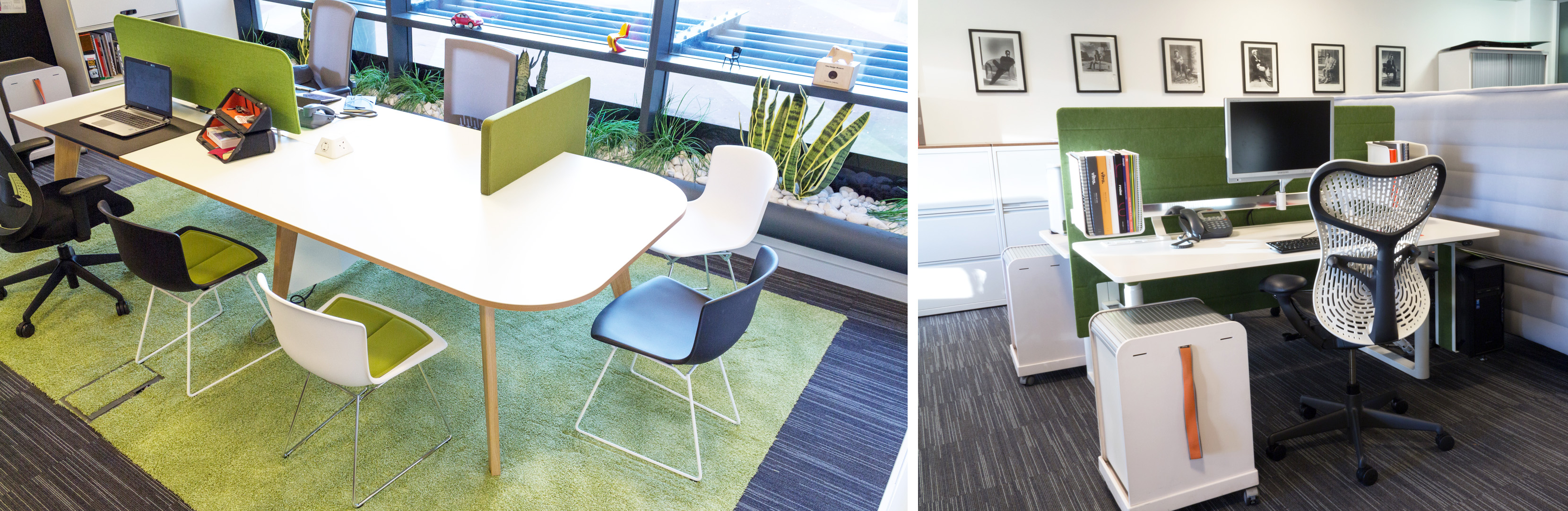
Now more than ever, we are seeing the lines blur within design…a cross pollination of materials, furniture and space utilisation has become noticeable between sectors. Workplaces are moving away from desk based environments and are embracing softer, more homely finishes and third space furniture. Residential developments are looking more like luxury hotels, while hotels are now introducing schemes that resemble communal apartment style spaces. Not to mention that in Tokyo, you can now stay in a hostel that masquerades as a bookshop.

Furniture design is progressing in tandem with this industry change, and in recent years, new furniture trends have been emerging to keep up with this shift. Old classics are being made over with a fresh face and manufacturers are now offering a wider range of finishes. The classic Bertoia Side Chair now comes in a more playful plastic version and last year we wrote about Walter Knoll’s revamp of some mid-century Turkish designs…the Burgaz, Rumi and Fishnet chairs. Not only that, Fritz Hansen also welcomed back the Drop chair after a 50 year hiatus. These pieces could reside happily within a restaurant or hotel setting, or just as easily suit an office, meeting or reception space.

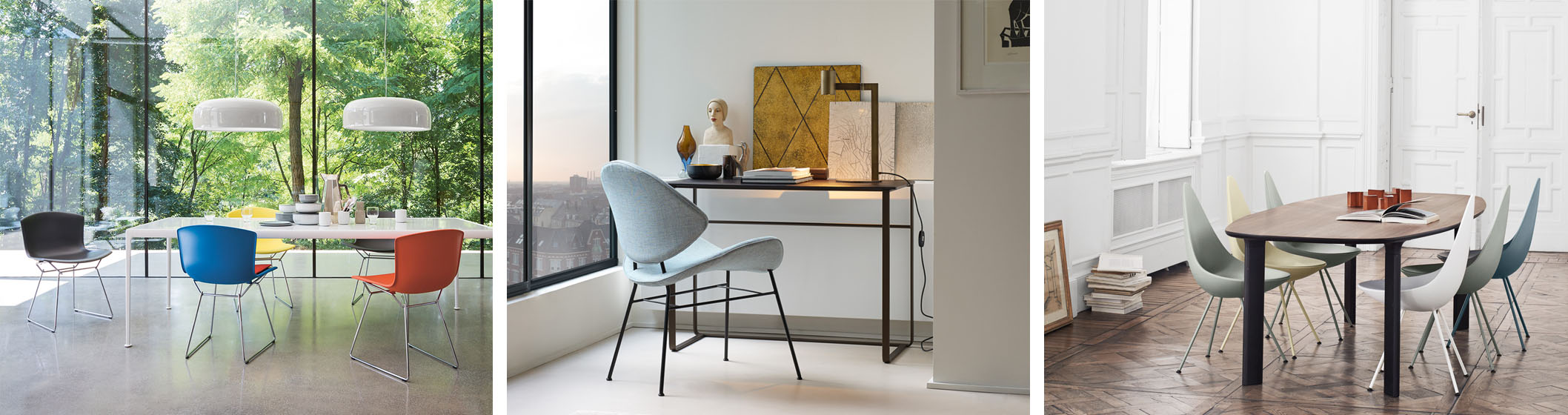
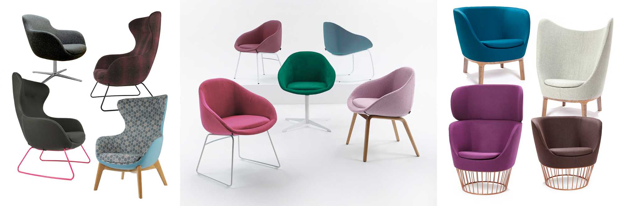
Features such as two tone fabric, metallic, coloured and timber legs are more frequently offered as standard options now, making furniture more flexible than ever. These details are filtering through all sectors of design and have largely been embraced by manufacturers such as FroviNaughtone and Connection. Each boast a wide selection of finishes in their portfolio, creating a smorgasbord of options suitable for application across multiple sectors. Some of the most adaptable ranges available are the Ilk family of chairs (Frovi), the Always selection of chairs and lounges (Naughtone) and the Dixi range, from Connection.

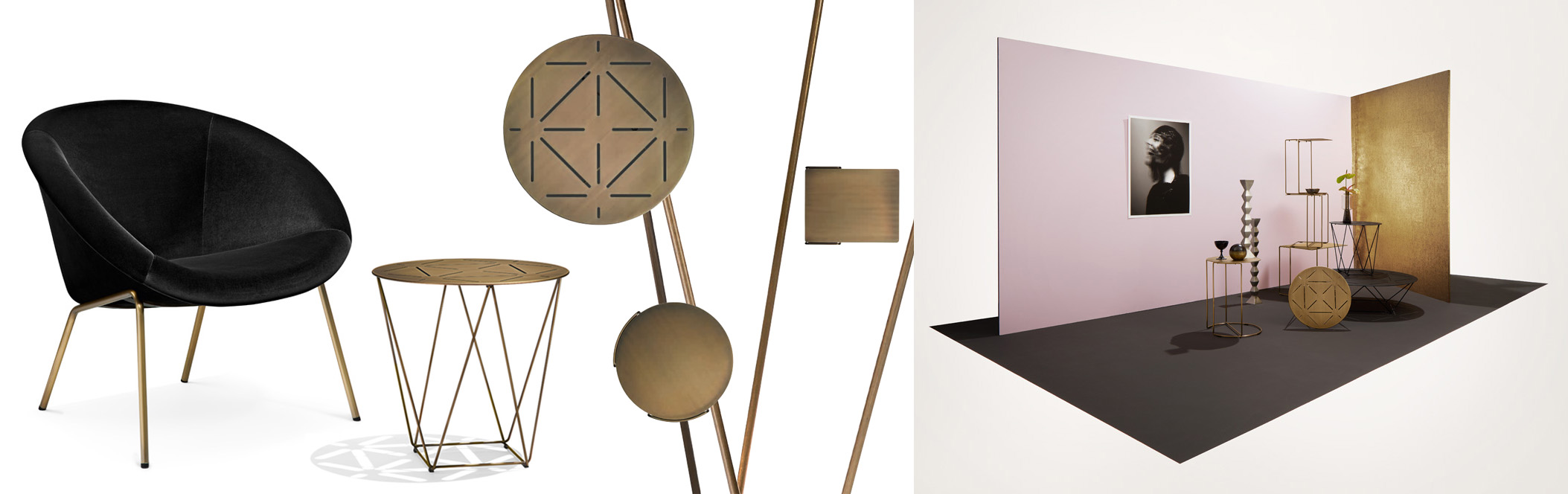
In a move to broaden their appeal in the leisure and hospitality market, Walter Knoll have chosen to forego the recent trend of gold in favour of hand textured brass. Their unique brass pieces were showcased at IMM in Cologne last month with the 369 chair, Joco and Oki occasional tables. Walter Knoll feel that these items provide a warmth that was previously lacking in their collection, making them suitable for residential and hotel applications.

So, whether it’s chairs for an office meeting space, restaurant stools, or lounges for a hotel lobby, the blurred lines of furniture design now make it easier than ever to find just the right piece for any space.

The Gold Standard

Maybe it’s due to the inspiring swag of gold medals Great Britain won in the Olympic games last year; or perhaps it’s the recent release of the movie Gold; or maybe it’s just because everyone wants a little more sparkle in their lives…whatever the reason, gold is making a resurgence. In the furniture world, 2017 seems to be the year of the bling (in stark contrast to Pantone’s colour of the year, Greenery).

Just announced last month, Fritz Hansen’s Choice 2017 is a new interpretation of Arne Jacobsen’s iconic Series 7. Based on the rich, yet delicate colours of the Japanese cherry blossom, these two, limited edition chairs ooze with understated luxury. Both the deep-red merlot and pastel nude options are complemented perfectly by their rose gold frames…giving them just the right balance of glitz and sophistication.

In contrast to this subtlety, Knoll have dared to go all out in conjunction with the wave of gold furniture releases. To celebrate its 50th (golden, of course) anniversary, the entire Platner range is now available in 18 karat gold plated options to dazzle even the most tarnished of gold cynics. And if that isn’t enough, Knoll have also released the Bertoia Diamond Chair in a stunning 18 karat gold version, to commemorate the designer’s would be 100th birthday.

Artemide seem to be taking on the same ‘go gold or go home’ approach as Knoll, with the release of the Tolomeo Tavolo Micro in yellow gold. Adding to the extensive Tolomeo family, this desk based, gold version of the classic lamp is a limited edition, making it all the more precious.

So even though all that glitters is not gold, these pieces are beautifully glamorous interpretations of their classic counterparts…and definitely worth their weight in gold.

The Grass is Always Greenery

Earlier this month, Pantone announced their 2017 Colour of the Year, and it’s looking…well…green. As opposed to the muted tones of their 2016 offering (Serenity and Rose Quartz), next year’s colour, Greenery, is bold. Describing it as ‘fresh and zesty’, Pantone said Greenery was chosen for its representation of the natural world and our growing desire to unplug and reconnect with our physical environment. Pantone feel it is a revitalising shade, symbolic of new beginnings. This is good news for workplace design as Greenery is the perfect colour to inject life into the sometimes grey landscape of the workplace.

With biophilic design and retro patterns gaining popularity recently, there are plenty of Greenery options already on offer for 2017. Interface have carpet covered with their Employ Lines (above), Human Nature, Scottish Sett, and Urban Retreat collections all sporting the Pantone 2017 Colour of the Year.

Camira has a host of fabrics for Greenery to be incorporated on task chairs, sofas and armchairs too. Their Nettle NomadHebden and Landscape Contact ranges all have retro Greenery tones to choose from.

In case that still isn’t enough of the Pantone 2017 Colour of the Year, Fritz Hansen, Vitra and Herman Miller have Greenery options in some of our favourite furniture pieces, such as Series 7, Alcove Family and the Sayl Chair.

However you might like to introduce the Pantone 2017 Colour of the Year into your workplace, there are plenty of options available. Here at Corporate Workspace we just completed our own office reboot…and the main colour chosen for the new additions? Greenery, of course.